Code
library(ggplot2)
library(ROCR)
library(ggpubr)
library(caret)
library(gtsummary)
source(here::here("load_data.R"))library(ggplot2)
library(ROCR)
library(ggpubr)
library(caret)
library(gtsummary)
source(here::here("load_data.R"))For all of these, we need to calculate \(p_{i} = P(y_{i}=1)\), the probability of the event.
\[ p_{i} = \frac{e^{\beta_{0} + \beta_{1}x_{1i} + \beta_{2}x_{2i} + \ldots + \beta_{p}x_{pi}}} {1 + e^{\beta_{0} + \beta_{1}x_{1i} + \beta_{2}x_{2i} + \ldots + \beta_{p}x_{pi}}} \]
| Characteristic | log(OR) | 95% CI | p-value |
|---|---|---|---|
| age | -0.02 | -0.04, 0.00 | 0.020 |
| income | -0.04 | -0.07, -0.01 | 0.009 |
| sex | |||
| Male | — | — | |
| Female | 0.93 | 0.21, 1.7 | 0.016 |
| Abbreviations: CI = Confidence Interval, OR = Odds Ratio | |||
The predicted probability of depression is calculated as: \[ P(depressed) = \frac{e^{-0.676 - 0.02096*age - .03656*income + 0.92945*sex}} {1 + e^{-0.676 - 0.02096*age - .03656*income + 0.92945*sex}} \]
Notice this formulation requires you to specify a covariate profile. In other words, what value X take on for each record. Often when you are only concerned with comparing the effect of a single measures, you set all other measures equal to their means.
Let’s compare the probability of being depressed for males and females separately, while holding age and income constant at the average value calculated across all individuals (regardless of sex).
\[ P(depressed|Female) = \frac{e^{-0.676 - 0.02096(44.4) - .03656(20.6) + 0.92945(1)}} {1 + e^{-0.676 - 0.02096(44.4) - .03656(20.6) + 0.92945(1)}} = 0.193 \]
\[ P(depressed|Male) = \frac{e^{-0.676 - 0.02096(44.4) - .03656(20.6) + 0.92945(0)}} {1 + e^{-0.676 - 0.02096(44.4) - .03656(20.6) + 0.92945(0)}} = 0.086 \]
The probability for a 44.4 year old female who makes $20.6k annual income has a 0.19 probability of being depressed. The probability of depression for a male of equal age and income is 0.086.
We can use the predict() command to generate a vector of predictions \(\hat{p}_{i}\) for each row used in the model.
phat.depr <- predict(dep_sex_model, type='response')
gghistogram(phat.depr, add = "mean" , fill = "skyblue")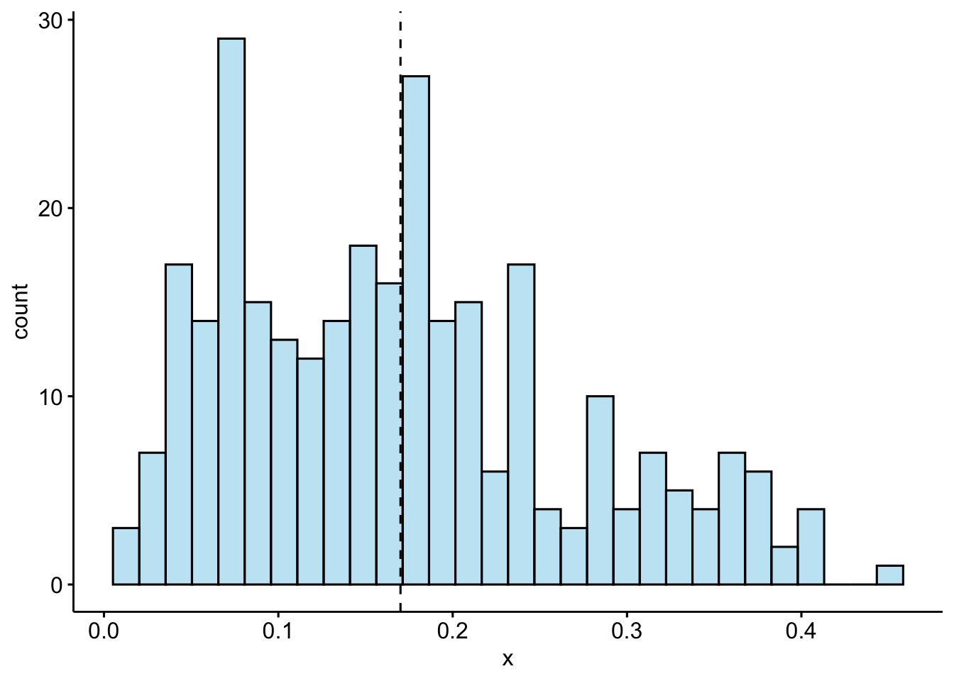
The average predicted probability of showing symptoms of depression is 0.17.
There was a significant effect of gender on depression diagnosis. How does that appear in the predicted probabilities?
Any row with missing data on any variable used in the model will be dropped, and so NOT get a predicted value. So the tactic is to use the data stored in the model object.
model.pred.data <- cbind(dep_sex_model$data, phat.depr)
tail(names(model.pred.data))
[1] "regdoc" "treat" "beddays" "acuteill" "chronill" "phat.depr"ggpubr::ggdensity(model.pred.data, x="phat.depr", add="mean", color = "sex", fill = "sex", palette = c("#00AFBB", "#E7B800"))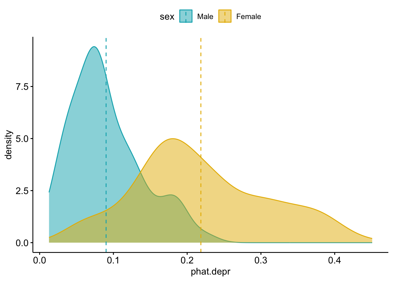
To classify individual \(i\) as being depressed or not, we draw a binary value (\(x_{i} = 0\) or \(1\)), with probability \(p_{i}\) by using the rbinom function, with a size=1.
set.seed(12345) #reminder: change the combo on my luggage
plot.mpp <- data.frame(pred.prob = phat.depr,
                       pred.class = rbinom(n = length(phat.depr),
                                           size = 1,
                                           p = phat.depr),
                       truth = dep_sex_model$y)
head(plot.mpp)
pred.prob pred.class truth
1 0.21108906 0 0
2 0.08014012 0 0
3 0.15266203 0 0
4 0.24527840 1 0
5 0.15208679 0 0
6 0.17056409 0 0Applying class labels and creating a cross table of predicted (rows) vs truth (cols):
plot.mpp <- plot.mpp %>%
            mutate(pred.class = factor(pred.class, labels=c("Not Depressed", "Depressed")),
                    truth = factor(truth, labels=c("Not Depressed", "Depressed")))

table(plot.mpp$pred.class, plot.mpp$truth)
                Not Depressed Depressed
  Not Depressed           195        35
  Depressed                49        15
The model correctly identified 195 individuals as not depressed and 15 as depressed. The model got it wrong 49 + 35 times.
The accuracy of the model is calculated as the fraction of times the model prediction matches the observed category:
(195+15)/(195+35+49+15)[1] 0.7142857This model has a 71.4% accuracy.
We will see later how to use accuracy as a measure of model fit and how to optimize accuracy by changing the cutoff value.