Describing Distributions of Data
2025-09-15
Single Categorical
Frequencies (N)
Percents (%)
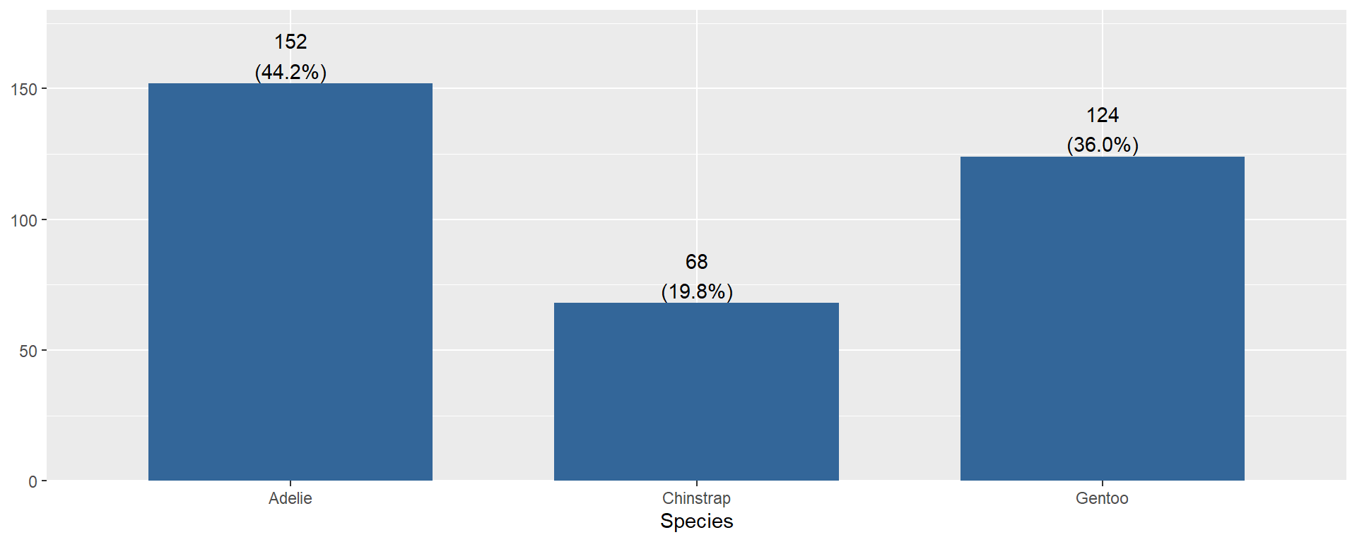
- Must include both the count
Nand the percent%. - Don’t need to describe every bar, just the 1-2 that stand out. E.g. largest and smallest? Categories that you care about.
Penguin species Adelie make up 44% of the sample (n=152)
Single Numeric
   Min. 1st Qu.  Median    Mean 3rd Qu.    Max.    NA's
  13.10   15.60   17.30   17.15   18.70   21.50       2
The average bill depth is 17.15mm, with a median of 17.3mm
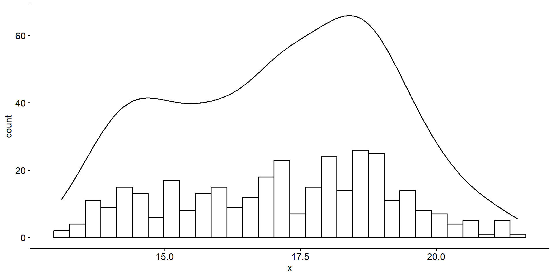
The distribution of bill depth appears to be bimodal with peaks around 15 and 18mm.
   Min. 1st Qu.  Median    Mean 3rd Qu.    Max.    NA's
13.10 15.60 17.30 17.15 18.70 21.50 2 [1] 1.974793[1] 3.1Bill depth ranges from 13.1 to 21.5mm, has an IQR of 3.1mm and a standard deviation of 1.9mm.
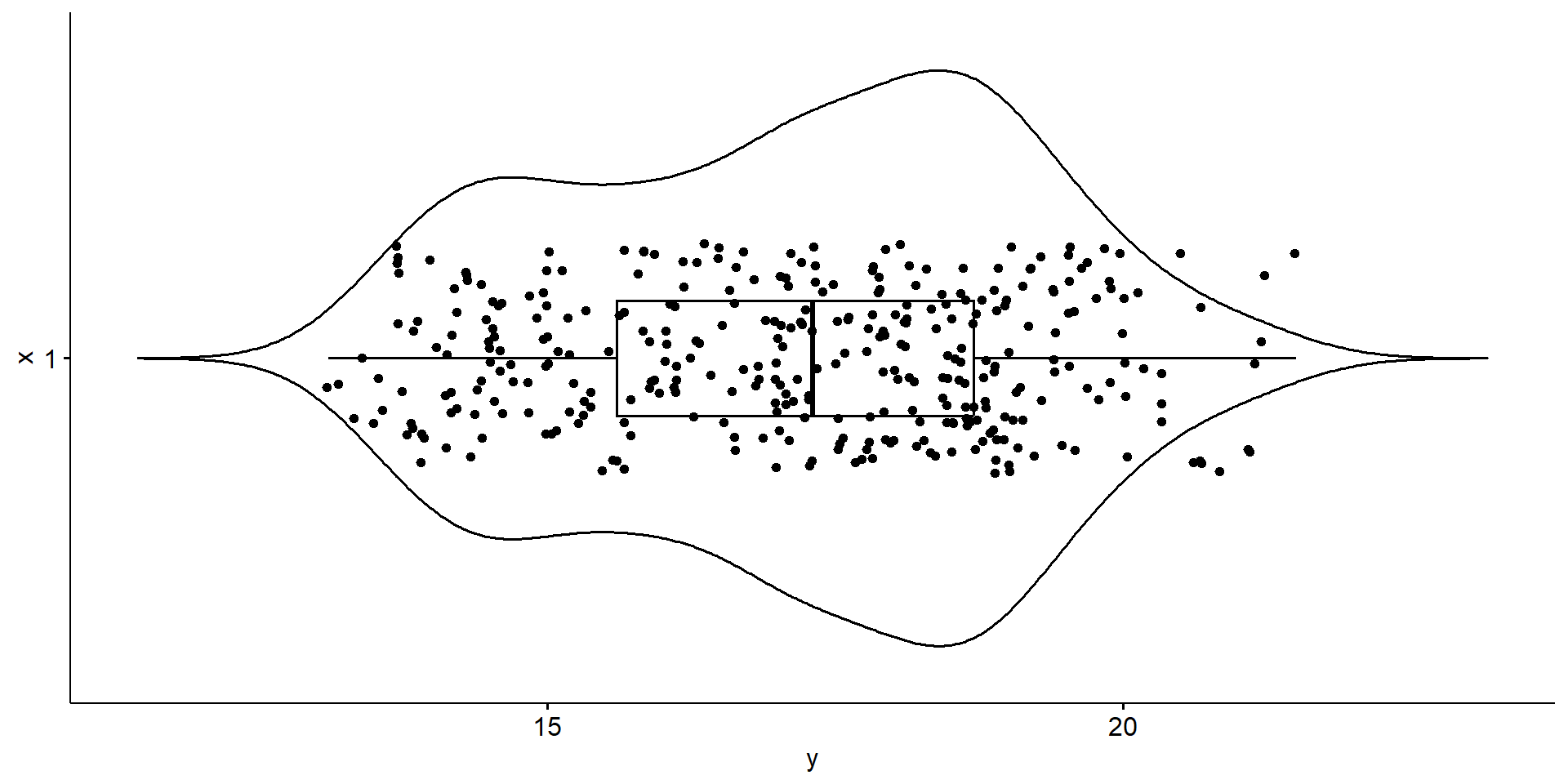
- Describe the
center,shapeandspread. - Include numbers
- Always in context of the problem
The average penguin bill depth is 17.15mm, with a standard deviation of 1.9mm. Ranging from 13.1 to 21.5mm, there is a bimodal pattern with peaks around 15 and 18mm but otherwise no skew is noted and no outliers are present.